Pleroma

Pleroma

Richard Moss | @MossRC@social.mossrc.me

Author of *Shareware Heroes: The renegades who redefined gaming at the dawn of the Internet* and *The Secret History of Mac Gaming*, as well as two upcoming books — one on the creation of #AgeOfEmpires and the other about the history of football (soccer) games.

Writer/director on TerrorBytes: The Evolution of Horror Gaming, an upcoming five-part docuseries about horror games. Producer/co-writer on FPSDOC, a 4.5-hour documentary film celebrating the first-person shooter genre (with an emphasis on the 90s/early-2000s golden age) that's guided by the developers themselves.

Creates The Life & Times of Video Games and Ludiphilia podcasts.

He/him.

rich@mossrc.me
@MossRC on Twitter and @mossrc.bsky.social on Bluesky.

Posts mainly about #gamedev and #indiegames histories and stories, #retrogaming/#retrogames, #retrocomputing, #classicmac, #shareware, #tombraider, and #videogamehistory.

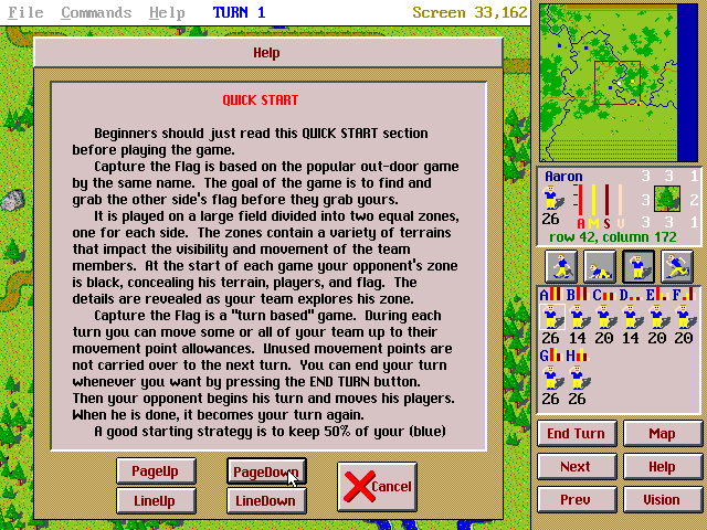
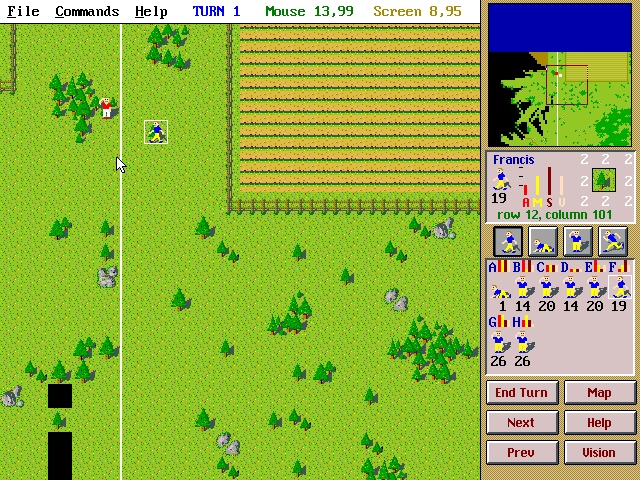
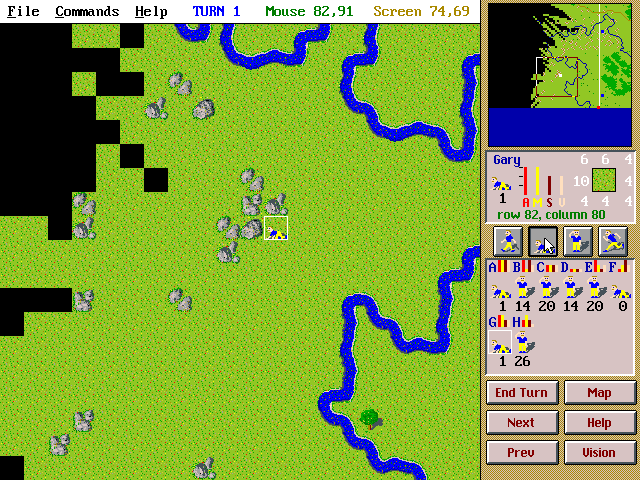
I quote-tweeted about this game earlier on the birdsite, but it's such wholesome fun I thought I should share here — this is Capture the Flag, a once-popular mid-90s shareware DOS game inspired by an overnight boy scouts trip and Sid Meier's Civilization. It's a non-violent and rather-elaborate computer version of the traditional sport, and it has you spend most of your time exploring the map or running across fields and ducking behind rocks, trying to be unseen by the other team(s).

I covered its development and reception in my Shareware Heroes book, along with creator Richard Carr's other excellent games (and the work of many other shareware creators).
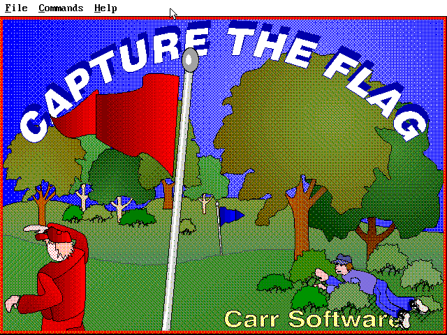
Capture the Flag game title screen. A red team lookout peers to the left while a blue team member hides in a bush, ready to jump out and rush for the red flag. A Quick Start guide for Capture the Flag. The visible text here talks about how the field is divided into two equal zones, one for each side. There are many different terrain types that affect visibility and movement, and you take turns navigating this space, exploring concealed territory. Your goal is to grab the other side's flag before they grab yours. A screenshot from an in-progress match. Francis is walking towards the midpoint line, while a red team player stands nearby in the trees Another screenshot of the game in progress. A blue team player is crouched behind a rock because he is almost out of movement points and wants to remain hidden from view.

That foreboding castle could only mean one thing: Dark Castle is next up in my #macicons series. While it was impossible to make a miniature version of the game's iconic title screen (because that relied on animation and sound for its frightening thunderclap), what I always thought cool is that if you click on the icon and then click off it you kind of get the same sense of a lightning flash.

Old-school Mac (and maybe some Amiga and Apple IIgs) people will know what a special game this was in its original form, and how incredible its 1-bit dithered graphics were for the time. The rest of you, get informed (but stay away from the console ports; instead, read my Mac gaming book or find some videos and retrospective articles by people who knew the game back when it was new).
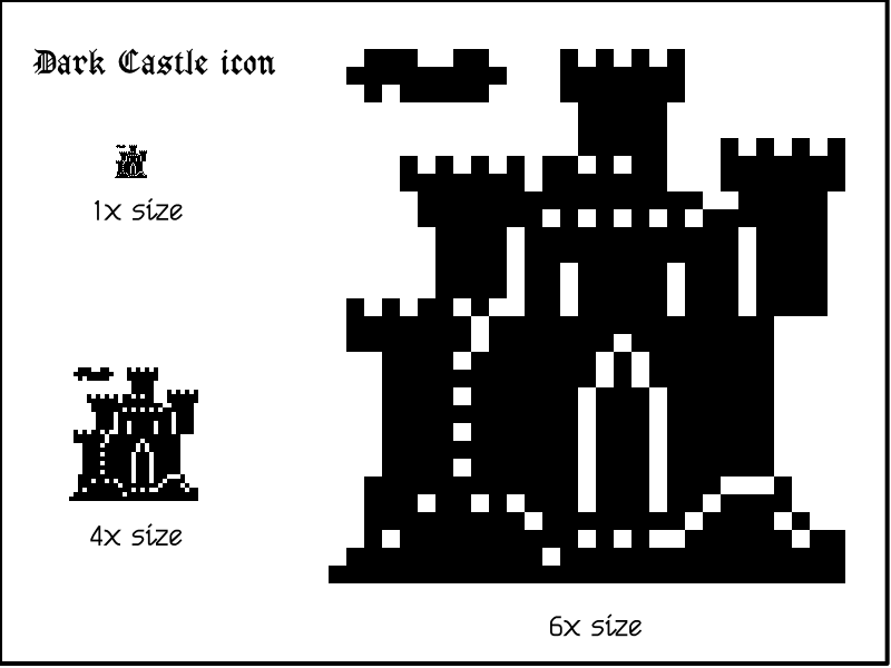
The icon for classic Mac game Dark Castle, depicting a dark and foreboding castle in a 1-bit 32 by 32 pixel illustration.

ticket sales are open! Join us in for the ! Early bird discount now available! Follow @auc for updates! https://auc.edu.au/devworld/registration/
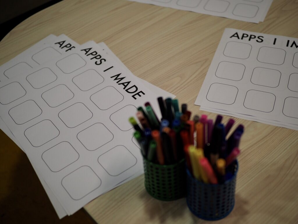
Some blank pieces of paper with empty iOS app icons and coloured pens on a table with the heading “Apps I Made”, for people to draw on at the /dev/world event!

Well folks, I can finally announce my secret project...

I'm writing a book about the history of Maxis Software for Limited Run Games. Stay tuned for info about the book currently known as SIMEVERYTHING!
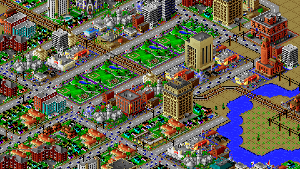
A cityscape from SimCity 2000.

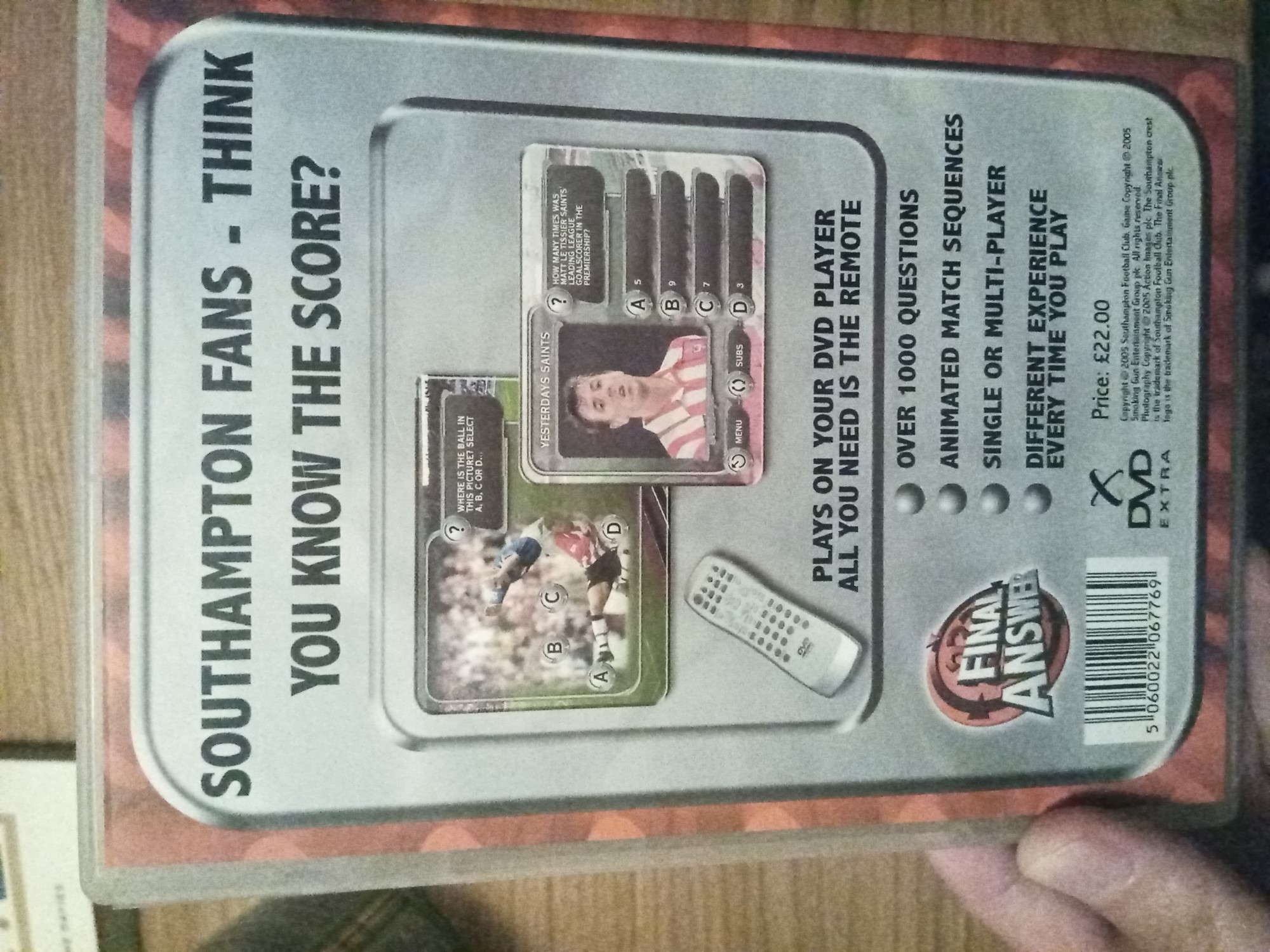
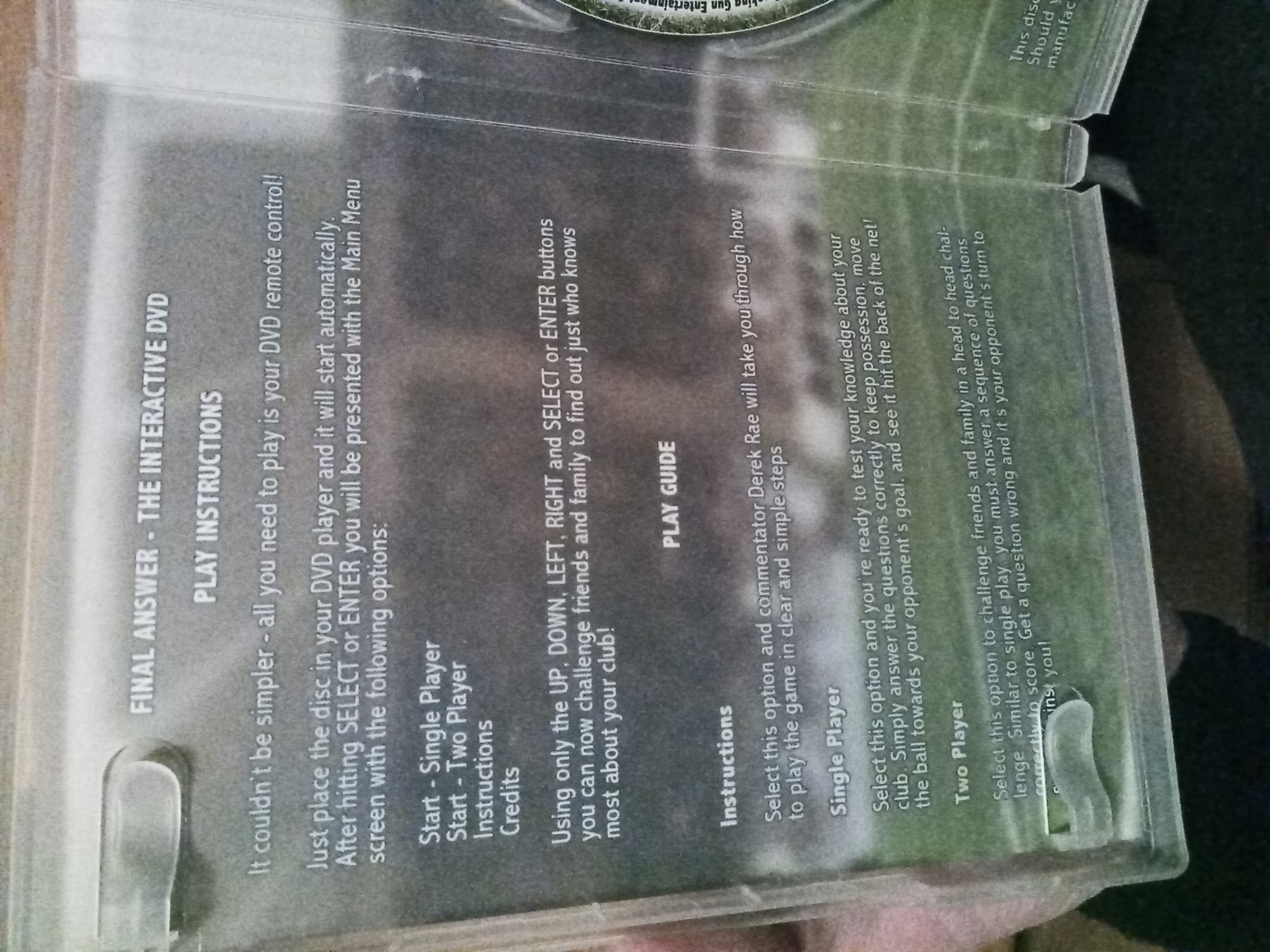
Got this obscure interactive DVD game today. Final Answer: Southampton FC. "The game you play with your remote control." This was one of many DVD trivia games released by Smoking Gun in 2005.

They made a business out of doing licensed football games for professional clubs (not even just top-tier ones, either) in England, Scotland, and sometimes across Europe. They never did regular action stuff (Codemasters had that market cornered), but they also did loads of club management sims from around 2003-5. I have a QPR one in my office.

DVD case front cover. "Interactive DVD game. Final Answer: Southampton FC. The game you play with your remote control." DVD case back cover. "Southampton fans - you think you know the score?" It then has screenshots of questions involving Matt Le Tissier and an unnamed player's famous tackle, before adding that all you need to play is your DVD remote. It also lists four features: over 1000 questions, animated match sequences, single or multiplayer, and a different experience every time you play. It retailed for 22 GBP in 2005. DVD case inside cover. Features basic instructions on how to play using the directional buttons on your DVD remote.

Having just replied to a lovely new comment on the YouTube video, I’m reminded that it’s been a while since I shared this livestream I did with Escape Velocity creator Matt Burch about the EV series several years ago: https://youtu.be/oYMZQINXW_s

i spent the weekend researching mac os x Aqua interface elements, and stumbled upon this classic collection of icons from 2000.

in the early 2000s, PixelJerk aka Samuel Krueger was one of the first to publish high-quality Aqua-themed icons for the new Mac OS X operating system.

few other icon designers demonstrated such skill and creativity with their icon sets.

it took the entire day, but i (by hand) converted each of these 200 Macintosh Icon format files into PNG and ICNS formats used in modern macOS. 😓

pixeljerk.com has been offline for 20 years... huge thank-you to macmonkies.com for keeping the only copy of these icons that exists on the web!

macOS version:
https://rootmarm.com/pixeljerk_icons/PixelJerk_macOSX_ICNS.zip

png version:
https://rootmarm.com/pixeljerk_icons/PixelJerk_PNG.zip

macintosh system7/8/9 version:
https://rootmarm.com/pixeljerk_icons/pixeljerk_pack_macintosh.zip

mac garden entry:
https://macintoshgarden.org/apps/pixeljerk-os-x-aqua-icon-collection
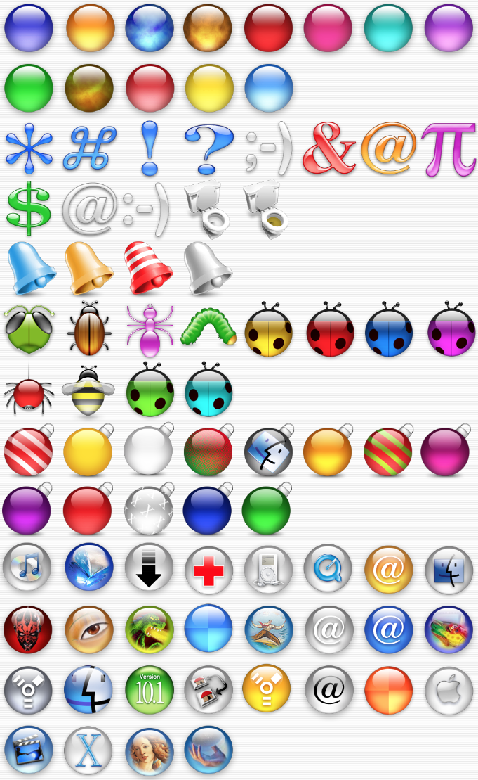
A sub-set of the PixelJerk collection. Each icon is a high contrast fruit-coloured object, in the style of the MacOS Aqua theme.

The "lickable" quality of each button is apparent in the design, texture and lighting... much like a Jolly Rancher.

Anyone well-versed in Polish games history able to help me understand the broader context and significance (and maybe popularity too) of two old football games — Rzuty Karne from 1987 (for the ZX Spectrum) and Liga Polska Manager from 1995 (for Amiga and PC)?

Do you periodically burn out?

I've just learned something while researching that could benefit you...

I was reading the work of autistic researcher Dora Raymaker.

She explained that the functioning of an autistic person running up to burnout can look like a "seneca cliff".

A seneca cliff is a model of a system which shows that growth or functioning is pretty good (even seeming to increase) and then, when decline comes, functioning falls off the cliff...at a rate much faster than growth.

It occurred to me that lots of people say to me "I was fine until I wasn't" or "I felt like I was actually ramping up or doing much more until I burnt out".

With this in mind, if it's hard for you to know when a burnout is coming (we can't always tell when we're in it), then you could reflect on whether or not you've been ramping up or putting in extra effort...this might indicate that a crash could be coming.

If this is helpful, pass the information on to your , or friends and family.

This is a graph of what a seneca cliff looks like. There is a line showing that the system is growing or functioning well, and the line dips down sharply to indicate fast collapse once the system has expanded past what it is capable of dealing with.

New! @MossRC with a fascinating post on Tiger Woods PGA Tour 10, reaching the upper limits of realistic motion controls, and why the frisbee mode is the best:

https://www.superchartisland.com/tiger-woods-pga-tour-10

@iainmew Just FYI, I had to copy and paste the URL to open the link for some reason — it didn't render as a link. (Maybe it isn't getting parsed correctly by Mastodon/your instance with the www bit at the start?)

@plauk I think it's a shame we've never seen much exploration of that nested inventory idea. Another version with the kinks and quirks smoothed out would be really interesting.

As for Enchanted Scepters being a point-and-click adventure, it comes down to semantics. It's rare that there are actually any clickable objects in the illustrated scenes, but you can of course use the mouse to operate all the menus and select commands. (Many later World Builder games included lots of clickable objects and hotspots, though.) Whereas most people would probably think of "point and click" meaning that you can use the mouse to directly interact with objects in a scene. Hence why I called Deja Vu "arguably" the first.

3000 icons - 3559

Next up in my #macicons series, let's look at Deja Vu: A Nightmare Comes True (1985). It was arguably (though perhas not technically) the first point-and-click adventure game and the first title in the #macventure series (that includes the more popular Shadowgate).

ICOM's concept was to make a game version of a 1960s pulp novel, with gritty characters and noir vibes and a cynical, dry-humoured narrator. I think the icon nails that perfectly.
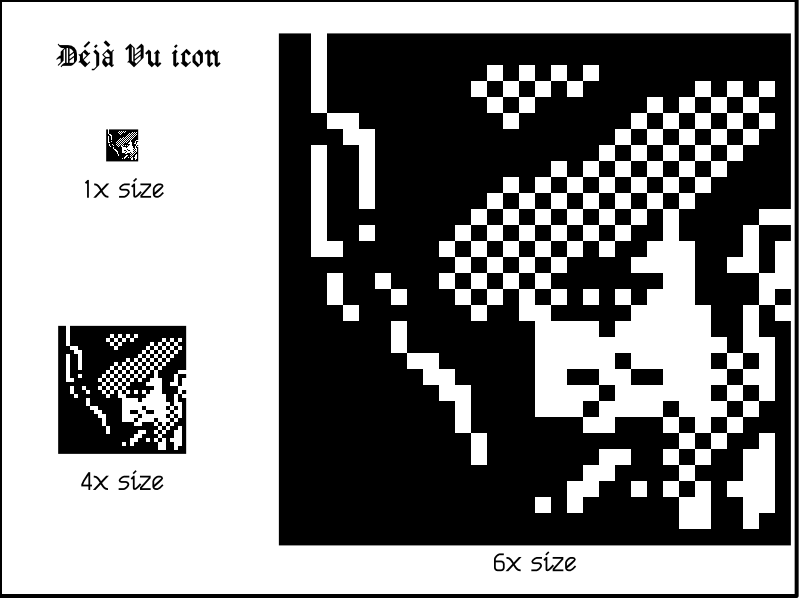
The icon for classic Mac game Deja Vu: A Nightmare Comes True. It's a 32x32 pixel 1-bit black-and-white illustration (that I've blown up to a larger size) of a man who looks like he's been lifted straight out of a mid-20th-century crime drama — beard stubble, cigarette, hat tipped over one eye, scar over the other eye, and directional lighting that puts him partly in shadow.

Always a treat to see Books get the spotlight. ♥️📚

In the latest @TWiT, @leo chats with
@Unbound CEO, Wil Harris, and showcases some really great reads from authors like:

Laura Kate Dale, Daniel Hardcastle, Andy Robertson, Richard Moss, and Konstantinos Dimopoulos.

@bookstodon

@apt I have all the original 32x32 icons in either PNG (lossless compression) or TIFF (uncompressed), then I use nearest neighbour scaling to resize (aiming for a factor of 32 — an integer multiple — with the new size to maximise accuracy).

Oh, also, I did a big long interview with the guy who made it, Bob Pappas, a few years ago. He sent me some photos to show how he did the swing animation, along with various other things. I'll include his story in my second Mac gaming history book, to be called something like *The (Even More) Secret History of Mac Gaming* or simply *The Secret History of Mac Gaming Volume 2*, when I eventually get that done.

Returning to my #macicons tribute posts, here's MacGolf, first released for black-and-white Macs in 1985. This was one of the earliest golf games to employ the behind-the-golfer perspective that became standard for the genre, and the icon does a remarkable job of both saying "hey I'm a golf game" and showing what the game looks like when you play it. The icon was later colourised for a re-release with colour graphics in-game.

As best as I can guesstimate from my Mac gaming history research, MacGolf was *probably* the best-selling Mac game of the 1980s other than Flight Simulator (which may or may not count as a game).
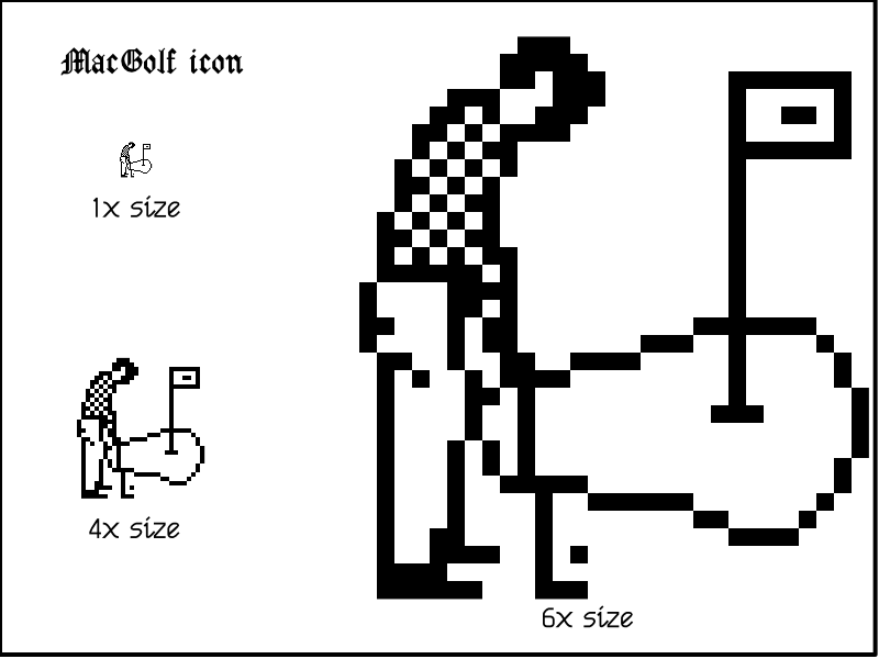
The MacGolf icon. It's a 1-bit pixel art drawing of a male golfer with a checkerboard pattern on his shirt. He's holding a golf club that looks like a putter, looking ready to swing to hit the ball. The green and the pin are a short distance in front of him.

celebrating palette cycling that mark ferrari pioneered in

this scene is from the last chapter of Indiana Jones and the Fate of Atlantis. the combination of complementary colours and a restricted palette produces one of the finest ferrari-esque palette cycles i've ever seen.

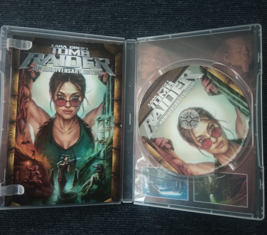
Just received this thing of beauty: a DVD repackaging of the cancelled Tomb Raider 10th Anniversary Edition that Core Design worked on before Crystal Dynamics got their competing version greenlit, complete with fan patches and other content.

Thank you so much to @Ash for putting this together and to everyone who's helped to preserve and expand on this wonderful bit of history.
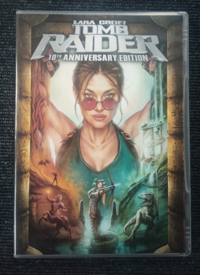
The front of the Lara Croft Tomb Raider 10th Anniversary Edition DVD case, featuring professional artwork of classic Lara Croft and great moments from the game. Inside the DVD case, there's a printed manual on the left and a DVD on the right The inside of the case includes a description of the DVD contents: unfinished builds of the game, fan patches to make it more stable, and related media. It directs you to tomb-of-ash.com or the latest updates and says the DVD "is made specifically for archival purposes." Also in the photo are the credits pages from the manual.

»