Pleroma

Pleroma

Richard Moss | @MossRC@social.mossrc.me

Author of *Shareware Heroes: The renegades who redefined gaming at the dawn of the Internet* and *The Secret History of Mac Gaming*, as well as two upcoming books — one on the creation of #AgeOfEmpires and the other about the history of football (soccer) games.

Writer/director on TerrorBytes: The Evolution of Horror Gaming, an upcoming five-part docuseries about horror games. Producer/co-writer on FPSDOC, a 4.5-hour documentary film celebrating the first-person shooter genre (with an emphasis on the 90s/early-2000s golden age) that's guided by the developers themselves.

Creates The Life & Times of Video Games and Ludiphilia podcasts.

He/him.

rich@mossrc.me
@MossRC on Twitter and @mossrc.bsky.social on Bluesky.

Posts mainly about #gamedev and #indiegames histories and stories, #retrogaming/#retrogames, #retrocomputing, #classicmac, #shareware, #tombraider, and #videogamehistory.

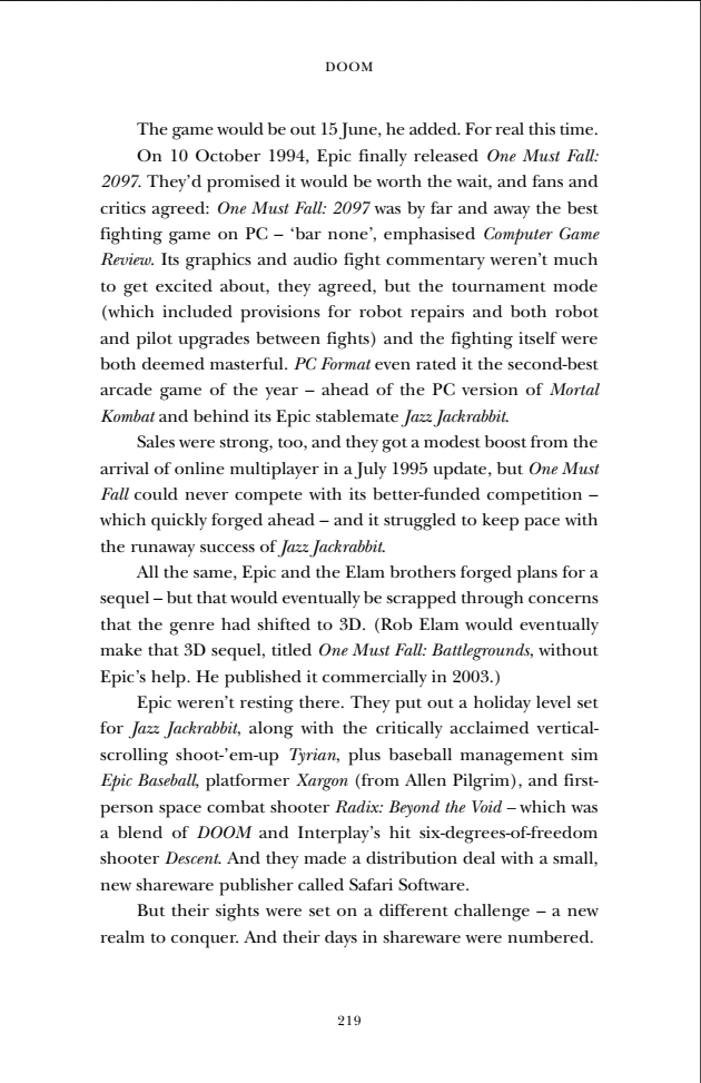
@vga256 Yes, I was made painfully aware of the fact that some people hated those margins and told Sam at Bitmap that it was priority number one to shift them inwards. Now it looks like this on text pages:

But I recently yesterday that I've never actually talked about Classic-era Mac icons on social media before, so I wanted to pay tribute to my favourite black-and-white Mac game icons. I'll take a leaf out of @winicons' book and show them at three sizes — given their tiny size, let's go original 32x32, 4x size at 128x128, and 6x size at 512x512. Let's start with my favourite Mac game, Glider, then I'll do one more a bit later today and others through the rest of December. Will use #macicons as a tag.

Glider was often called the quintessential Mac game, and for good reason — it hard charm, whimsy, quirkiness, and a friendly, open sense of discoverability about it. And creator John Calhoun managed to squeeze it down to 32 pixels by taking his paper plane sprite, a heating vent (used in the game to provide lift, so that the plane can return to the top of the screen for a fresh descent), and some dots to visualise the air currents — everything you need to know about how the game works. Plus it looks fantastic.
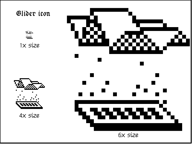
The icon for Glider displayed at three different sizes.

@lunarloony Yeah, I love her work and her thoughts on computing/interaction design, and I really dislike the direction that modern UIs went in. So many things are needlessly difficult or unintuitive now, and certainly there's less of a feeling of whimsy and discoverability about the way they look and work.

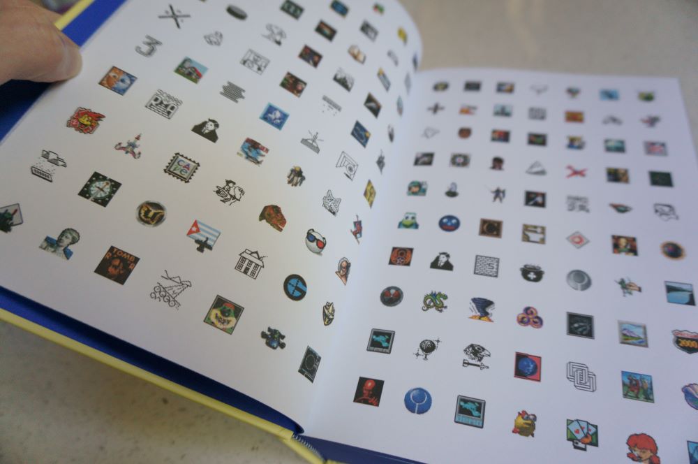
But what about games? How can you convey the richness of a game's world and/or its characters in such a limited form? The best b/w Mac game icons had a magic to them that stuck with me throughout my childhood and into my work in games and tech media. So it was important to me when Bitmap Books came calling about publishing an Expanded Edition of The Secret History of Mac Gaming that we put in my most-wanted missing feature from the first edition: an icon gallery (with both colour and b/w icons across the whole Classic era).
The Secret History of Mac Gaming Expanded Edition icon gallery spread

I'm a big fan of icons from the black-and-white Mac era. There's something so compelling about that question of how do you distil the essence of this app/game/function into a 32x32 pixel square using only black dots on a transparent white background? Susan Kare from the Mac team was especially great at this; her icons for Mac system apps are just phenomenal.

My brother and his wife run the Creative Power Award, a US$2000/AU$3000 grant and group mentorship for emerging US or Australia-based creators working at the intersection of art and social justice. The 2023 edition is open for applications until January 5th, so get to it if you're working part-time, freelance, or spare time on something special that could have real impact. https://www.creativepoweraward.org

@Zodypop Agreed on both counts. It'd be a huge task to try to finish it and sort out all the loose ends, though.

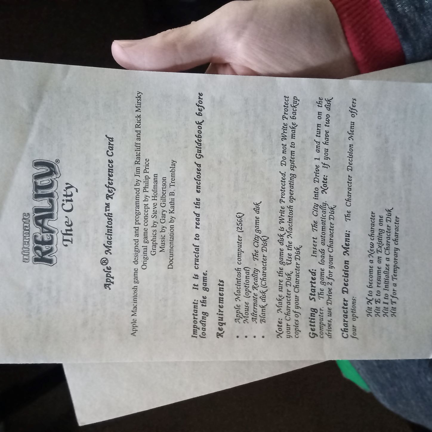
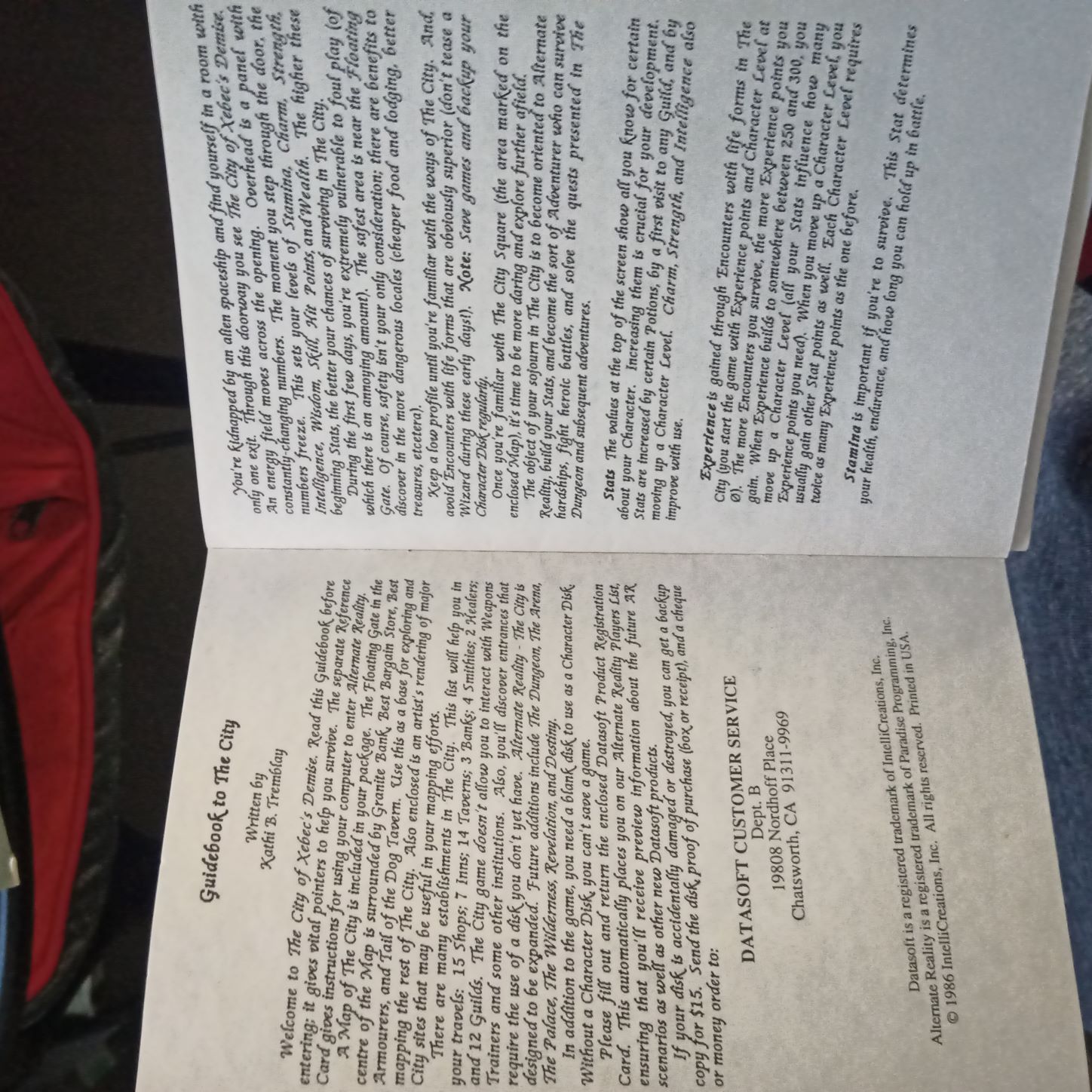
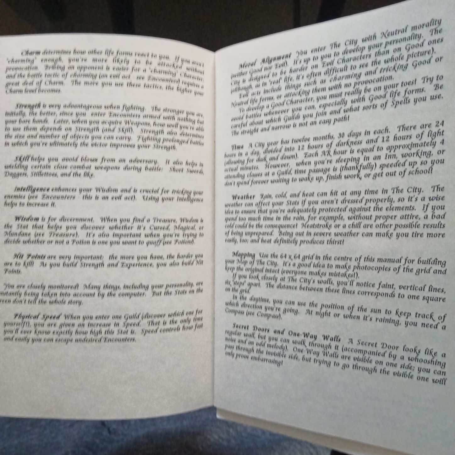
Still got the manual and Mac reference card inside, too. It's in a really nice font and there's even a partially-drawn map inside that you can finish as you explore the world.
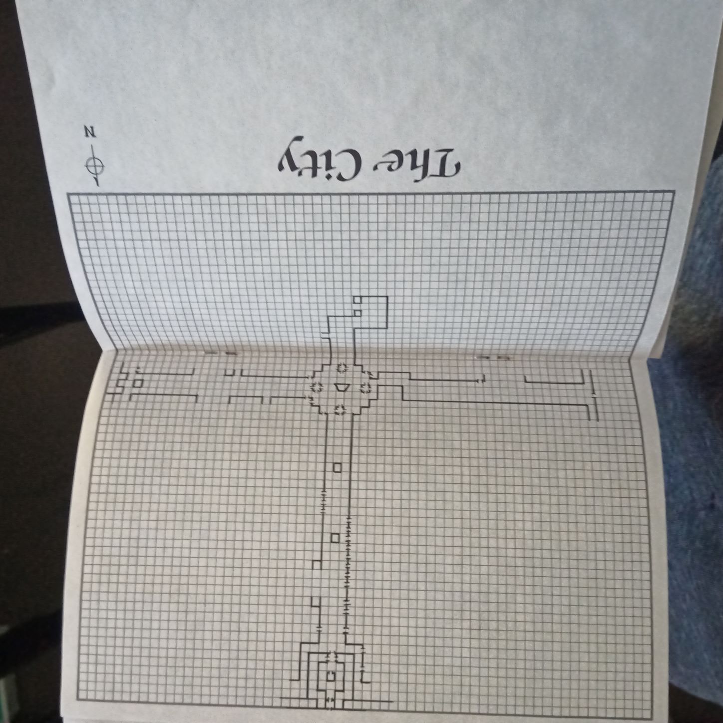
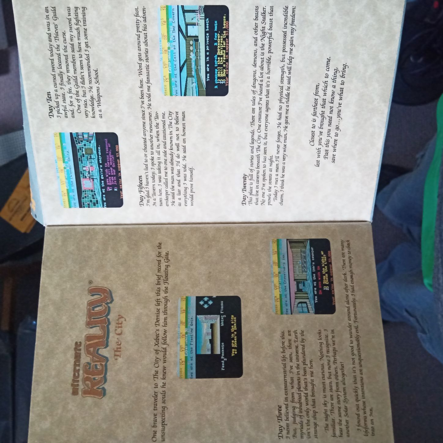
Mac reference card for Alternate Reality: The City First page inside of the manual for Alternate Reality: The City. This page has backstory on the game world. Another page inside of the manual for Alternate Reality: The City. This page has descriptions of some of the game's innovative features Another inside of the manual for Alternate Reality: The City. This page has a partially-drawn map on a 64x64 grid that you can finish as you play the game and explore its world.

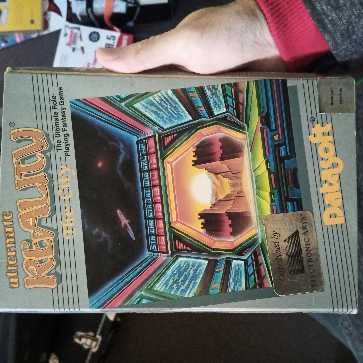
Turns out I still have the Alternate Reality: The City Mac box (though the disks are long gone).
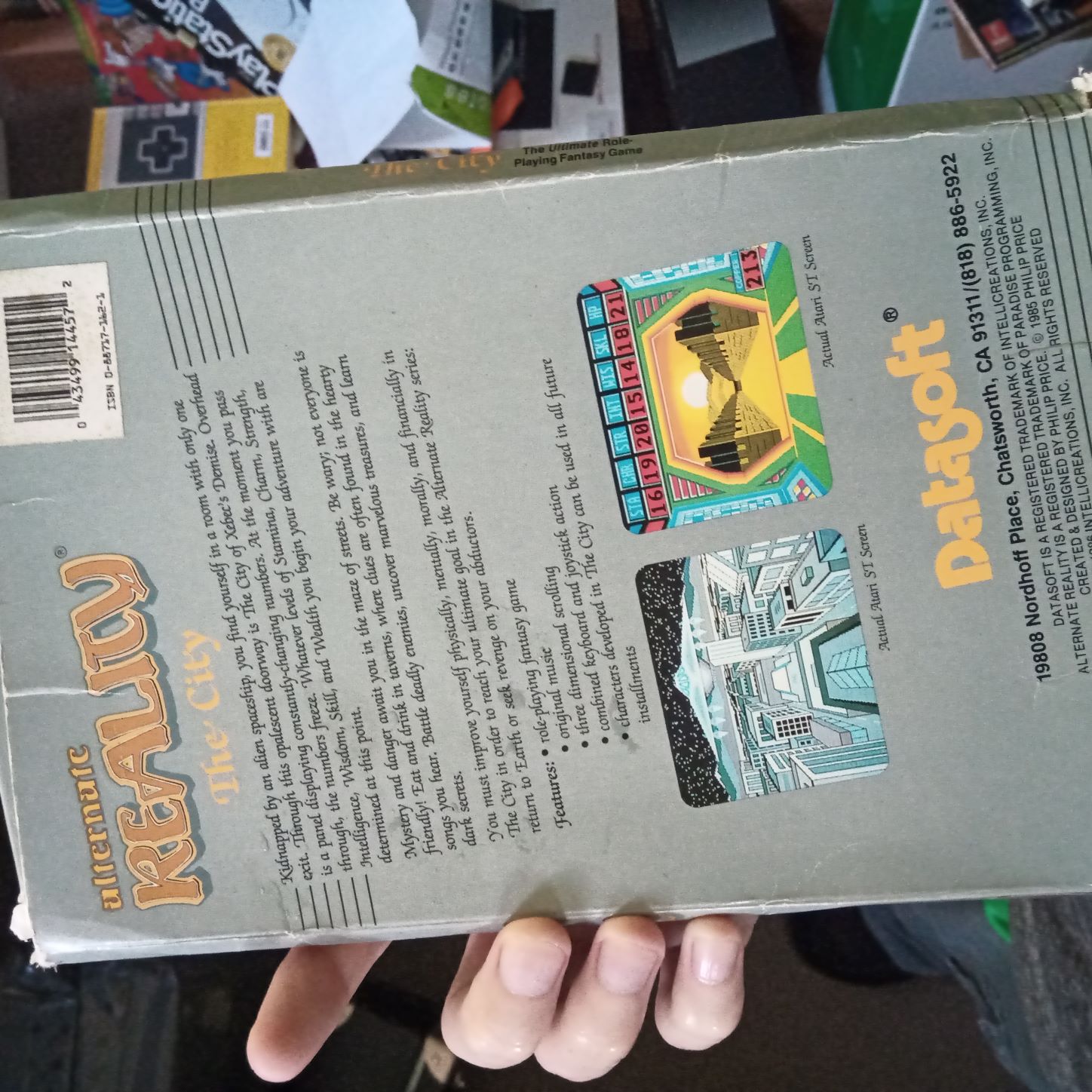
Photo of the front box cover of the Mac version of old CRPG Alternate Reality: The City Photo of the fold-out inside-front box cover of the Mac version of old CRPG Alternate Reality: The City Photo of the back box cover of the Mac version of old CRPG Alternate Reality: The City

The first game I ever played — a story I've told numerous times before — is now finally preserved properly and playable in a web browser, after years of working only partially and only in MESS/MAME (or on a real b/w Mac). This is the 1987 Mac port of Alternate Reality: The City, an ambitious, fascinating, and innovative open-world RPG first released on Atari 800 in 1985. https://archive.org/details/moofaday_Alternate_Reality_The_City

@a2_4am Watching my brother play the Mac port of Alternate Reality is one of my very earliest memories. But I shudder to think now how we reformatted and overwrote the floppy around the late 90s when I put the disk in and the computer said it was empty. Wonderful news to see it preserved properly at last.

If you play The Quest from an unauthorized copy, it lets you play for long enough to read the introduction and go buy stuff from the shop. Then on the way out of the shop, a huge Red Dragoon and company appear from nowhere complaining about software pirates, drag you away to the dungeon, and the machine reboots.
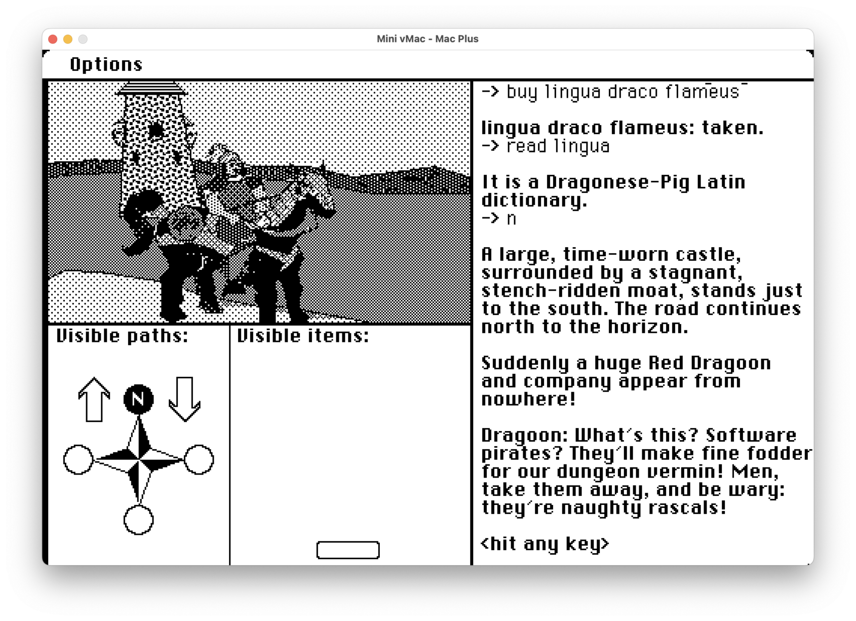
gameplay screenshot from "The Quest" complaining about software pirates

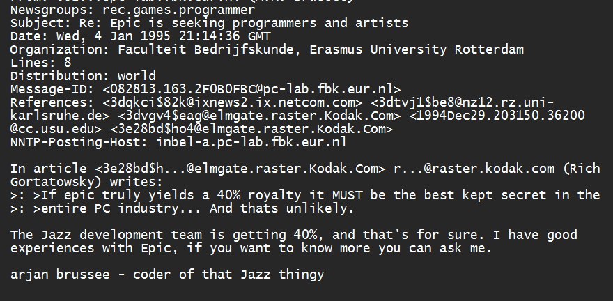
@MichaelKlamerus @dosnostalgic Having interviewed and corresponded with the man, and done an entire book on the shareware era, these documents he's sharing are gold but take all his stories with a grain of salt unless they're backed by verifiable data. I've never found him lying — just glossing over (or choosing to forget?) negative details or taking a little more credit than he deserves.

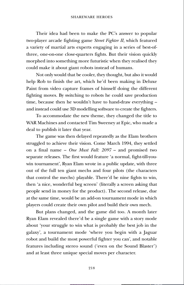
@dosgameclub Also of possible interest to you and others playing along, here's what I wrote / found out about One Must Fall 2097's history for my book Shareware Heroes. And there's an excellent fansite with lots of additional info about the game at http://omfuniverse.tk/

@DanNess 1991 for that one, actually. The other post was '94 and asks people to send an email. But yeah, different world. (And yet, remarkably, so much of the business of games is the same.)

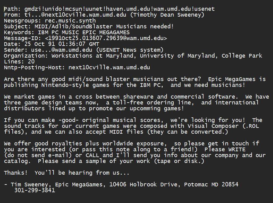
He's asking for a physical letter in the mail.

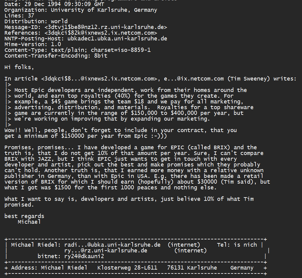
...Except this one time I found where a developer whose Epic-published game had sold poorly offered a counterpoint, proving as in all things that nothing is guaranteed; high royalties don't mean squat if your game is unpopular.

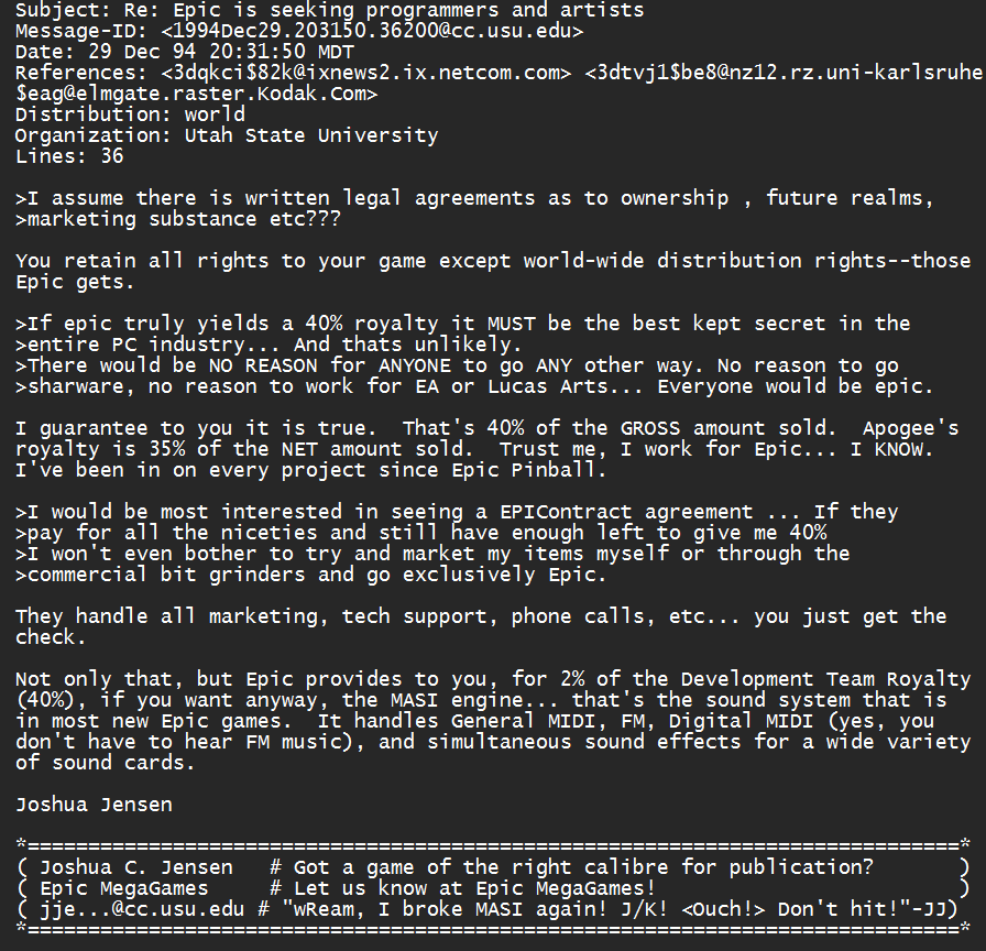
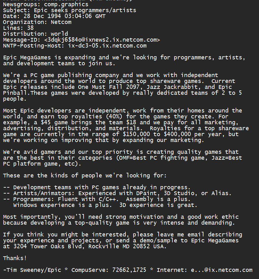
Sometimes he'd get pushback from people dubious about the royalties or suspicious that it sounds too good to be true and Epic must be doing something bad in the fine print. But people who worked with him would usually refute the claims. Epic was the real deal, they'd say.

As part of his quest to recruit shareware talent to help Epic compete with Apogee and bigger commercial publishers, Tim Sweeney would periodically post talent call-outs on Usenet. Here are two of them.

This year's conflict minerals report up, and it's concerning how many companies took their eye off the ball this year.

https://www.gamesindustry.biz/industry-shows-zero-improvement-on-conflict-minerals-sourcing
»