Pleroma

Pleroma

I'm a big fan of icons from the black-and-white Mac era. There's something so compelling about that question of how do you distil the essence of this app/game/function into a 32x32 pixel square using only black dots on a transparent white background? Susan Kare from the Mac team was especially great at this; her icons for Mac system apps are just phenomenal.

@MossRC I love the TED talk she did a few years ago. Modern operating systems don't feel as discoverable as they did in the 90s.
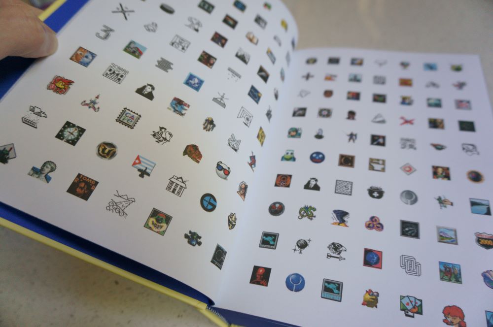
But what about games? How can you convey the richness of a game's world and/or its characters in such a limited form? The best b/w Mac game icons had a magic to them that stuck with me throughout my childhood and into my work in games and tech media. So it was important to me when Bitmap Books came calling about publishing an Expanded Edition of The Secret History of Mac Gaming that we put in my most-wanted missing feature from the first edition: an icon gallery (with both colour and b/w icons across the whole Classic era).
The Secret History of Mac Gaming Expanded Edition icon gallery spread

@lunarloony Yeah, I love her work and her thoughts on computing/interaction design, and I really dislike the direction that modern UIs went in. So many things are needlessly difficult or unintuitive now, and certainly there's less of a feeling of whimsy and discoverability about the way they look and work.

But I recently yesterday that I've never actually talked about Classic-era Mac icons on social media before, so I wanted to pay tribute to my favourite black-and-white Mac game icons. I'll take a leaf out of @winicons' book and show them at three sizes โ€” given their tiny size, let's go original 32x32, 4x size at 128x128, and 6x size at 512x512. Let's start with my favourite Mac game, Glider, then I'll do one more a bit later today and others through the rest of December. Will use #macicons as a tag.

Glider was often called the quintessential Mac game, and for good reason โ€” it hard charm, whimsy, quirkiness, and a friendly, open sense of discoverability about it. And creator John Calhoun managed to squeeze it down to 32 pixels by taking his paper plane sprite, a heating vent (used in the game to provide lift, so that the plane can return to the top of the screen for a fresh descent), and some dots to visualise the air currents โ€” everything you need to know about how the game works. Plus it looks fantastic.
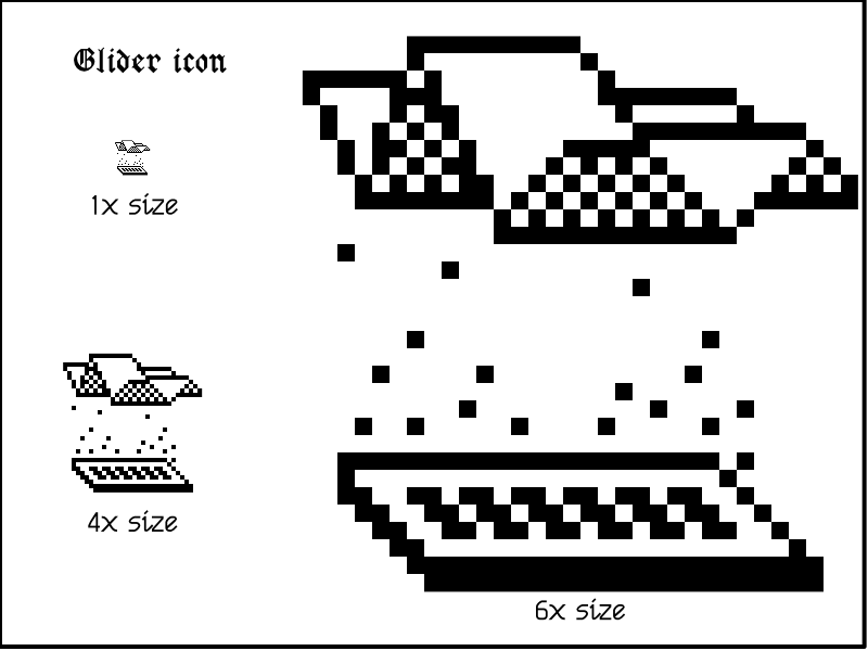
The icon for Glider displayed at three different sizes.
replies
0
announces
5
likes
20

@MossRC I can recognise some of them! ;-)

When I was really young, my father, a teacher, would bring me with him to his school and while he was preparing his courses I would spend hours looking at Macintosh illustrations printed in a binder (teachers would insert these on exercise sheets).

We have found a few of them here: https://egardepe.itch.io/hypercardgraphics but many are missing. Do you know by any chance where I could find more of these great illustrations?

@yrochat I do and I do not. That sounds cryptic, I know, but what I mean is that I've seen that kind of stuff on a number of old compilation CDs and users group floppy/CD collections, but I can't tell you which ones. Possibly some came from clip art libraries as well.

@MossRC I LOVE, love love love the personality of the early Mac era. Susan Kare deserves tremendous credit, and the whole community carried it forward.

@jesse She was such a treasure for the Mac team to have. What a wonderful thought it was that a computer OS could smile and say its own version of hello every time you turn it on, and to have a mascot that says "moof", and all those other delightful touches of whimsy and fun that she added.

@MossRC Agreed. I donโ€™t want to ascribe any magic powers to a specific person or team, but a HyperCard stack from 1990 has so much more personality and whimsy than most things made in 2020 and beyond.

@jesse To me, a lot of the problem seems to be that today's UI designers and programmers take little heed โ€” if they're even aware โ€” of the human interface guidelines Apple's Mac team wrote back in the mid-80s (or the underlying principles thereof). Too often they're chasing trends, giving themselves busywork, or optimising purely on data and stats, rather than following a principal that computers/software should be both fun and functional.

@MossRC I genuinely think there was something to Microsoft Bob. Even if it's Microsoft's laughing stock, the point was that it presented common tasks in a way people totally new to computers could understand. Now, those tasks just get hidden away, where even power users struggle to find them.

@lunarloony It's interesting how Bob is quaintly charming, and really kind of sweet, if you look at it now. I don't know if it was the marketing or the elitism of the PC tribe that made it fail, but it's a shame either way. And yes, I'm ever-frustrated by the game of "where'd they hide it now?" that I have to play when searching for settings I need to change on my Mac or PC, or once-simple tasks I'm trying to help a friend/relative accomplish on their iPhone or laptop.

@jesse @MossRC same here, which is the reason behind my YouTube channel. I didn't find much time to develop it in these last months, but I plan to present softwares and games from the era. I absolutely get the sense that I was pretty lucky to have gotten my first introduction to computers in that time. Many people as old or older as me jumped on board in the mid 90's of even later.

@yrochat @MossRC I've started to compile MacPaint collections but it's quite hard to find. That specific bicycle I'm half sure was reused in my MS Basic 2.0 book (in French) and it was pretty frustrating that they had an example program to type in that used it, but the book didn't provide the image at all other than just showing it on paper.

@MossRC Thank you for this answer. It gives me hope!

@MossRC Beautiful work of art