Do you periodically burn out?
I've just learned something while researching that could benefit you...
I was reading the work of autistic researcher Dora Raymaker.
She explained that the functioning of an autistic person running up to burnout can look like a "seneca cliff".
A seneca cliff is a model of a system which shows that growth or functioning is pretty good (even seeming to increase) and then, when decline comes, functioning falls off the cliff...at a rate much faster than growth.
It occurred to me that lots of people say to me "I was fine until I wasn't" or "I felt like I was actually ramping up or doing much more until I burnt out".
With this in mind, if it's hard for you to know when a burnout is coming (we can't always tell when we're in it), then you could reflect on whether or not you've been ramping up or putting in extra effort...this might indicate that a crash could be coming.
If this is helpful, pass the information on to your #autistic, #ADHD or #AuDHD friends and family.

New! @MossRC with a fascinating post on Tiger Woods PGA Tour 10, reaching the upper limits of realistic motion controls, and why the frisbee mode is the best:
As for Enchanted Scepters being a point-and-click adventure, it comes down to semantics. It's rare that there are actually any clickable objects in the illustrated scenes, but you can of course use the mouse to operate all the menus and select commands. (Many later World Builder games included lots of clickable objects and hotspots, though.) Whereas most people would probably think of "point and click" meaning that you can use the mouse to directly interact with objects in a scene. Hence why I called Deja Vu "arguably" the first.
ICOM's concept was to make a game version of a 1960s pulp novel, with gritty characters and noir vibes and a cynical, dry-humoured narrator. I think the icon nails that perfectly.
 of a man who looks like he's been lifted straight out of a mid-20th-century crime drama — beard stubble, cigarette, hat tipped over one eye, scar over the other eye, and directional lighting that puts him partly in shadow.")
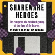
Always a treat to see #VideoGame Books get the spotlight. ♥️📚
In the latest @TWiT, @leo chats with
@Unbound CEO, Wil Harris, and showcases some really great reads from authors like:
Laura Kate Dale, Daniel Hardcastle, Andy Robertson, Richard Moss, and Konstantinos Dimopoulos.
#TheVideoGameLibrary #Gaming #VideoGames #Book #Books #Bookstodon @bookstodon
As best as I can guesstimate from my Mac gaming history research, MacGolf was *probably* the best-selling Mac game of the 1980s other than Flight Simulator (which may or may not count as a game).

celebrating #pixelart palette cycling #animation that mark ferrari pioneered in #adventuregames
this scene is from the last chapter of Indiana Jones and the Fate of Atlantis. the combination of complementary colours and a restricted palette produces one of the finest ferrari-esque palette cycles i've ever seen.
Thank you so much to @Ash for putting this together and to everyone who's helped to preserve and expand on this wonderful bit of history.


A lot of Obra Dinn has roots in a variety of classic Mac games. Obviously the art style, but much more of it too.
I recorded and edited the thing back in July-August, so I'm glad we've finally got a date on it.
It's been a long time since I wrote it, but I enjoyed re-reading it last year while doing a few updates to fix typos and an outdated author bio.
And good to know the system works; I guess purchasing power must be regarded as substantially lower where you are than in Australia. (If you want to pay at or above the regular price you still can, though.)
Currently I have the text-only version of *Secret History of Mac Gaming* and the *Football Manager, one day at a time* ebook on there. Will add other work I own distribution rights to as and when possible. (So nothing new for a while yet.)
https://mossrc.gumroad.com

TIL the WWW originally had a logo, and nothing else is better at expressing the naive academic techno-optimism from the 1990s than a design that looks hand-coded in PostScript and that slogan at the top.
