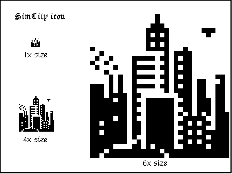
The original SimCity has a cool icon. It seems totally natural and logical when you look at it — a minimalistic silhouette of a city — but it couldn't have been easy translating all of that into 32x32 pixels while taking care to ensure there's something representative of all the game's key elements: residential, commercial, and industrial zones, plus the ever-present helicopter. #macicons

- replies
- 0
- announces
- 6
- likes
- 20
@MossRC Yeah, the mix of all those different patterns is really impressive.
